Branding for a real estate property and investment company focused on creating long-term value through professional management, transparency, and a modern approach to real estate.
DIRECTION
maps
real estate
branding
BRAND STRATEGY
VISUAL IDENTITY
SOCIAL & MARKETING
ASSETS
WEBSITE DESIGN
3D & Motion
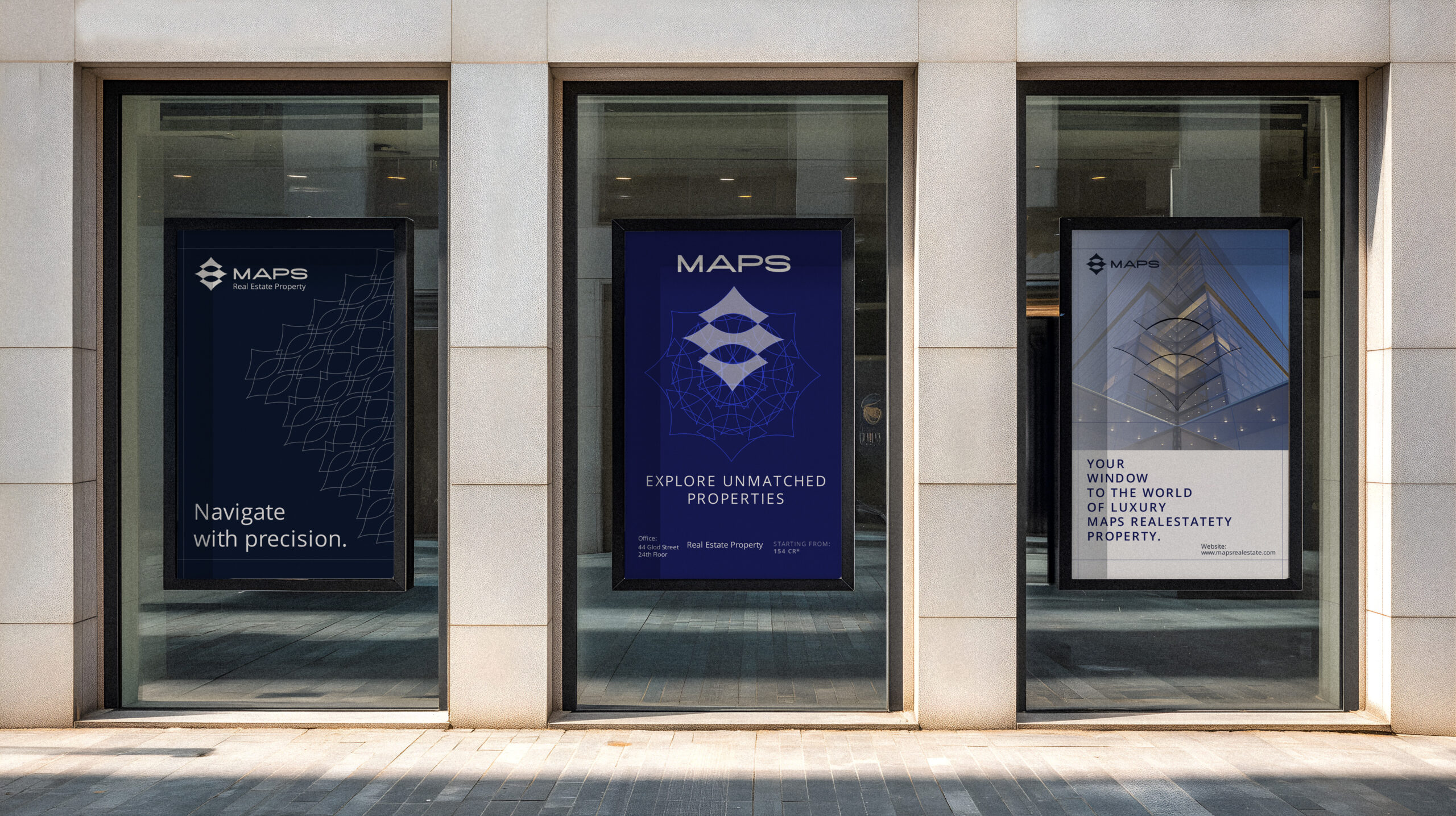
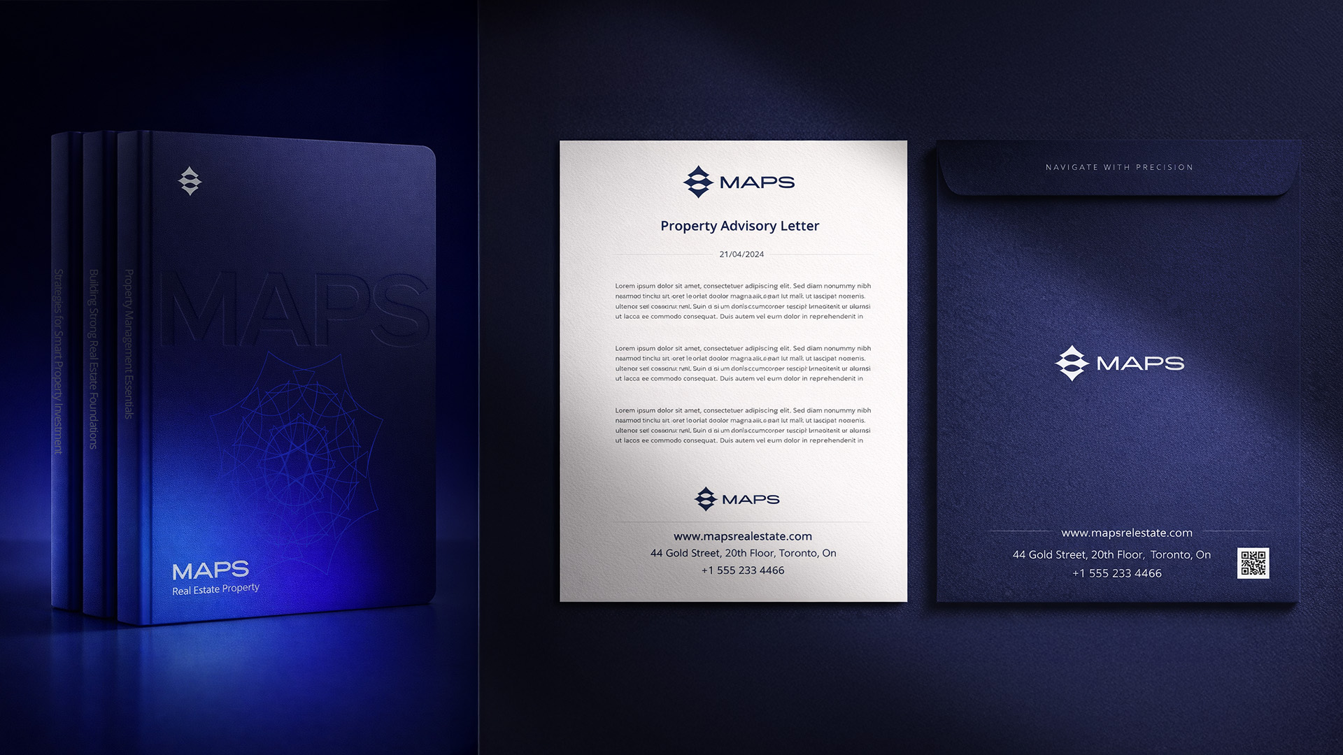
A complete brand identity for MAPS Real Estate, built on clarity, stability, and long-term value, using a clean and minimal visual language inspired by architecture and precision.
LOGO concept
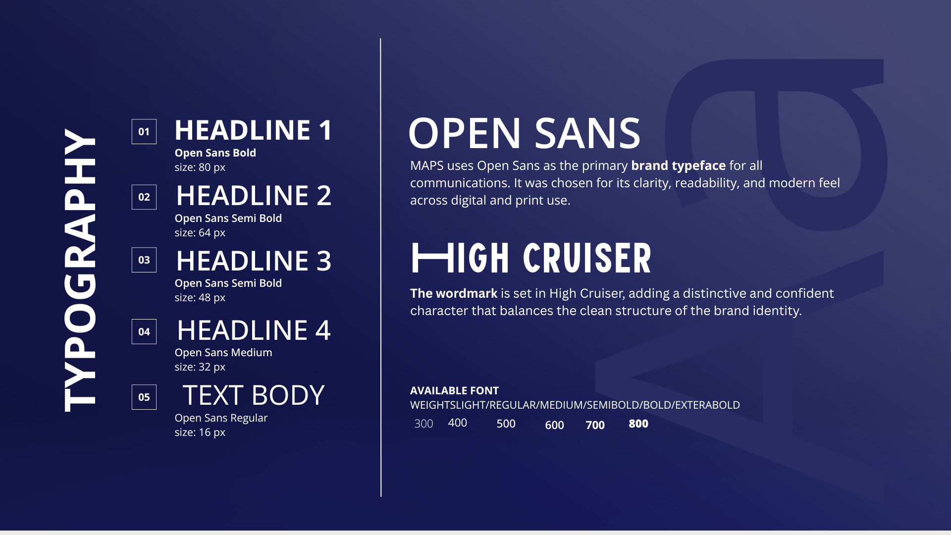
TYPOGRAPHY
COLOR PALETTE
The MAPS logo is inspired by home shape and map direction. The structure forms the letter “M” and represents stability, navigation, and long-term trust.
Open Sans is the main brand font, chosen for its clarity and modern look. High Cruiser is used for the word-mark to add a unique and confident character. The MAPS colour palette is based on deep and light blue tones, symbolising trust, professionalism, and reliability. Neutral colours such as white and dark shades support the main colours and ensure clarity and balance across all brand materials.